
Ever thought about which letter packs the biggest punch in English? Out of all 26 letters in our alphabet, letter I might just be the heavyweight champion. Not bad for what’s basically just a vertical line, right? Yet this simple stroke somehow manages to carry our identity, and our sense of self, and even sells our fancy tech products. Pretty wild when you think about it! I’ve always been fascinated by how this unassuming character stands out so boldly from its alphabetic neighbors.
A Letter That Defines Us
The letter I serves as more than just the ninth letter in our alphabet. It represents individuality in its purest form. When we speak of ourselves, this single letter carries the weight of our entire identity. It’s both humble and powerful at once – a paradox contained in a single stroke.
Letter I appears in countless words that define who we are. Think about it: identity, individual, imagination, intelligence. No way that’s just a random accident. Have you ever noticed how the letter kinda looks like a person standing up straight? I mean, it’s literally us – upright, tall, holding our ground. And get this – in English, “I” is the only single letter that always gets capitalized when used as a word. Talk about special treatment! Even tiny “a” doesn’t get that kind of respect.
A Vowel with a Voice: The Core Sounds of Letter I
Isn’t it crazy how one tiny little mark can sound so different depending on where you stick it? Blows my mind sometimes.
In English, our friend letter I basically plays two main roles. You’ve got the quick, snappy sound in words like “bit,” “hit,” and “sit” – you know, that short /ɪ/ sound that barely opens your mouth. Then there’s that longer /aɪ/ sound that starts deep and swoops up, like in “ice,” “bike,” and “time.” My linguistics professor called it a diphthong, which honestly sounds like something you’d catch at the doctor’s office.
These two sounds alone account for thousands of English words, but the letter I doesn’t stop there. In certain combinations, it transforms entirely. Consider “machine,” where it sounds like “ee,” or “onion,” where it becomes part of a completely different sound.
Around the world, letter I takes on even more personalities. In Spanish, it has a consistent “ee” sound. In French, it often combines with other vowels to create unique nasal sounds. Each language shapes this simple stroke into something distinctive.
The Eye of the Alphabet: I as a Visual Symbol
Visually, I stands apart with its striking simplicity. It’s essentially a single vertical line – the most fundamental mark humans make. This simplicity has made it remarkably consistent throughout history.
Typography designers often use I as a reference point when creating new fonts. Its proportions and relationship to other letters can define the entire character of a typeface. Some designers add serifs to give it stability, while others embrace its minimal form.
In logo design, the letter I frequently appears as a central element. Its tall, straight form can represent strength, directness, or simplicity. Think about how many brand logos feature a prominent I, often stylized but recognizable.
The letter also resembles the number 1, which reinforces its connection to individuality and primacy. This visual similarity isn’t accidental – both symbols represent singular, fundamental concepts.
From Egyptian Reeds to Roman Ink: The Birth of Letter I
(AI Generated)
The Evolution from Egyptian Reed to Modern Icon
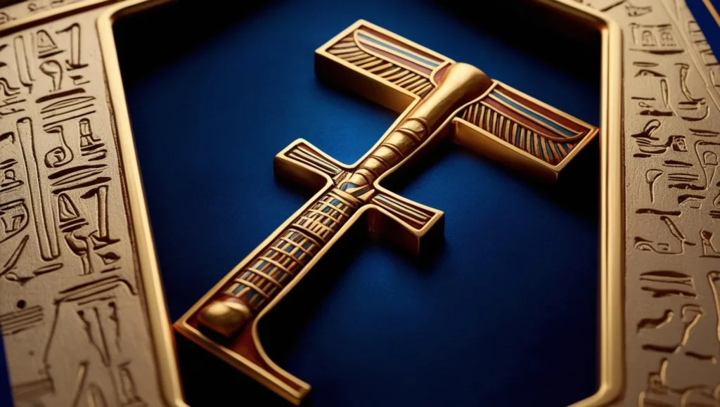
The journey of letter I began thousands of years ago in ancient writing systems. Its earliest ancestor might be found in Egyptian hieroglyphics, where a simple reed stood upright.
When writing spread from the Phoenicians to the Greeks, our little vertical line stuck to its guns. Didn’t change much at all! The Greeks named it “iota” – a tiny thing, really, but don’t let that fool you. Even back then, this simple mark packed a punch. Ever heard someone say “Not one iota”? Yeah, that’s where it comes from – something seemingly small that actually matters a ton.
When the Romans developed Latin script, they adopted this letter and maintained its straightforward design. The Roman letter I served double duty, representing both the vowel sound we know today and the consonant sound we now associate with J.
Throughout these transformations across civilizations, the core identity of I remained remarkably consistent – a testament to its fundamental design.
I or J? A Story of Alphabetic Identity Crisis
The Romans were pretty chill about the letter I – they used it for everything! Vowel sounds, consonant sounds, whatever. They’d write “iam” (what we’d spell as “jam” today) and “item” without batting an eye, using the same letter for totally different sounds. Talk about efficiency!
When I Became J: A Scribe’s Happy Mistake
Then the Middle Ages rolled around, and those monk scribes got bored copying manuscripts all day. Can’t blame them! They started getting fancy, adding little tails and hooks when I showed up at the start or end of words. Just a bit of medieval flair, you know? But guess what – those little decorative flourishes accidentally created a whole new letter! That’s how J was born. Seriously.
The funny thing is, nobody officially considered I and J separate letters until the 1500s. And even then, languages couldn’t agree on timing. Some dictionaries were still lumping them together into the 1800s! Like, “Nah, we’re good with just one letter, thanks.”
Even now, these letter cousins stay close in some languages. Take German – they pronounce J like our English Y. Weird, right? But it makes perfect sense when you realize it’s just I’s rebellious offspring that never fully broke away from home.
Letter I as a Word: The Birth of Self in Language
As a single-letter word, “I” stands as the ultimate linguistic shortcut to selfhood — a symbol packed with centuries of evolution and the weight of human consciousness.
(AI Generated)
Think about it – one tiny letter holds your entire existence! As our first-person pronoun, “I” is basically shorthand for everything you are. Pretty heavy stuff for a single character.
The word has a cool origin story, too. It started as “ic” in Old English (don’t ask me how to pronounce that), which came from even older Germanic languages. Over centuries, we got lazy and shortened it down to just “I” – probably the most bang-for-your-buck word in English. One letter, infinite meaning!
Whenever you drop an “I” in conversation, you’re basically announcing, “Hey world, I EXIST!” No wonder philosophers get all worked up about it. Descartes, with his “I think, therefore I am,” was obsessing over this same idea. One little letter that somehow contains your whole consciousness? Mind-blowing stuff after a few drinks.
And here’s a weird English quirk – we always capitalize “I” when most languages don’t bother with their equivalent words. We’re like, nope, gotta make sure everyone knows how important we are! Pretty on-brand for English speakers, if you ask me.
Why Letter I Is the Most Personal Letter in English
The capitalization of “I” speaks volumes about English-language attitudes toward individuality. No other major language capitalizes its first-person singular pronoun.
This practice began in Middle English, around the 13th century. Scholars debate whether it started for practical reasons (the lowercase “i” was easily lost on the page) or for more symbolic purposes, elevating the individual.
Why ‘I’ Always Stands Tall (Literally and Figuratively)
Either way, this capitalization has profound psychological effects. It visually reinforces the importance of the self each time we write it. The uppercase I stands tall and distinct, just as we see ourselves as significant individuals.
Some critics have suggested this capitalization reflects a cultural self-importance or ego-centrism. Yet others argue it simply acknowledges the fundamental importance of individual perspective in human experience.
The Role of I in Poetry and Literature
The letter “I” in poetry and fiction isn’t just grammar—it’s a portal into someone else’s soul, a literary tool that lets us see the world through another’s eyes.
(AI Generated)
You know that moment when you’re reading a poem or novel in first person and suddenly you’re RIGHT THERE in someone else’s head? It’s like literary telepathy! When Emily Dickinson writes “I heard a Fly buzz – when I died –” I get chills every time. She’s literally inviting us to experience her own death! Or take Whitman with his “I celebrate myself, and sing myself” – the dude was basically inventing the selfie in poetry form before Instagram was even a thing. These writers drop that magic little “I” and boom – we’re no longer just reading words, we’re borrowing someone else’s soul for a few pages.
Writers these days love messing with our heads using first-person narrators. You’re happily reading along, totally trusting this “I” voice, and then BAM – you realize they’ve been lying to you the whole time! Remember reading “Gone Girl”? Or “Fight Club”? Total mind-trips. When someone says “I” in a story, it’s like putting on their prescription glasses – everything gets filtered through their personal baggage, biases, and blind spots. Half the fun is figuring out what they’re not telling us, or what they’re seeing all wrong. Unreliable narrators are literary gaslighting, and honestly, I’m here for it.
The Iconic Simplicity of I in Typography
(AI Generated)
Typographers have a complex relationship with the letter I. Its simple form presents both opportunities and challenges in font design.
In serif fonts, the Letter I typically has small projections at the top and bottom. These serifs help guide the eye and create rhythm across a line of text. In sans-serif designs, I becomes even more minimal – a perfect rectangle.
Some typographers create subtle curves or variations in thickness to give I more personality. Others maintain its geometric purity as a counterbalance to more complex letters.
The letter I serves as a natural divider in text, creating visual breathing space. Yet it can also create spacing challenges – words with multiple I’s can appear too open unless carefully adjusted.
The Invisible Partner: I in Digraphs and Vowel Teams
Letter I rarely works alone when creating sounds. It partners with other vowels to create entirely new phonetic effects, showing its versatility.
In the digraph “ai” (as in “rain”), I helps create a long A sound. In “ei” (as in “receive”), it creates a long E sound. These vowel teams produce sounds that neither letter makes independently.
Other important I-containing digraphs include “ie” (belief), “oi” (voice), and “UI” (suit). Each combination follows different rules and creates distinct sounds.
Even more complex are trigraphs like “igh” in “high” and “light.” Here, I works with two other letters to create a stable sound pattern across many English words.
Languages Beyond English: How I Morphs and Moves
(AI Generated)
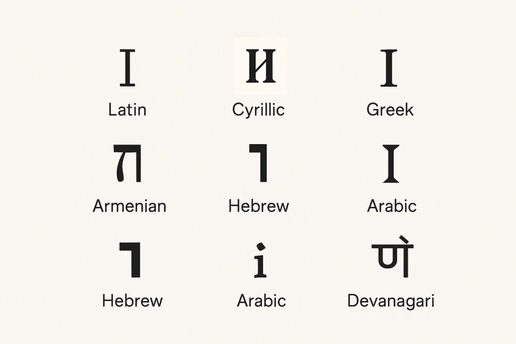
Across languages, the letter I takes on diverse roles and sounds, demonstrating its fundamental importance in human communication.
In Italian, the I creates a clean “ee” sound, as in “pizza.” Spanish similarly uses I for this sound, though it can also serve as a connector between consonants.
German uses I in its important diphthong “ei,” pronounced like the English long I. French uses I in combinations that create nasalized sounds unique to that language.
In Turkish and other languages using diacritical marks, I appears in multiple forms. Turkish distinguishes between dotted “i” and dotless “ı” – each with its own distinct pronunciation.
The Dot Above: How a Tittle Changed Everything
(AI Generated)
Did you know that the little dot over the lowercase i actually has a name? It’s called a “title”! Yep, that’s really what it’s called – makes me chuckle every time. Such a silly-sounding name for something so tiny, but this microscopic mark has a pretty cool backstory and actually does something important. Who knew?
Titles emerged during medieval times when handwritten text needed greater clarity. The dot helped distinguish “i” from similar letters like “m,” “n,” and “u” when written in sequence.
This small addition revolutionized reading speed and accuracy. Without the title, words like “minimum” would be nearly impossible to decipher in handwritten form.
Ever wondered where we got that saying about “dotting your i’s and crossing your t’s”? It’s literally about these tiny marks! When someone tells you to dot your i’s, they’re not just being annoyingly perfectionist – there’s actual history here. It’s wild how these microscopic details can completely change the meaning of something. Miss one little dot and “minimum” becomes an unreadable mess of vertical lines. Sometimes it’s those seemingly insignificant details that end up mattering most – in writing and probably in life too, if I’m feeling philosophical about punctuation (which apparently I am today).
Tech & Branding: Why Letter I Means ‘Intelligent’
(AI Generated)
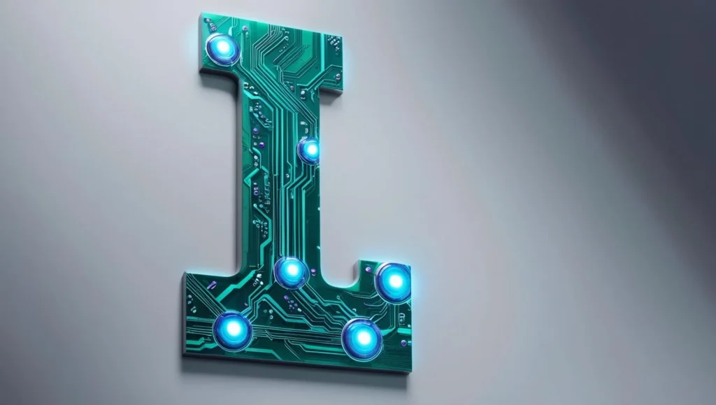
In modern technology branding, “i” has become a powerful prefix signifying intelligence, innovation, and individuality.
I in Branding: Why iPhone, iPad, iRobot?
Apple’s revolutionary naming convention – iPhone, iPad, iMac – set a trend that countless other companies have followed. The lowercase “i” suggests both “internet” and “individual” – perfect for personal technology.
Beyond Apple, countless tech products and services leverage the power of I: iRobot, iHeartRadio, and iDrive. The letter has become shorthand for anything digitally enhanced or personalized.
This branding trend reflects how deeply the letter I connects to our sense of self in the digital age. It suggests technology that’s responsive to our individual needs and preferences.
Hidden Meanings: I in Religion and Symbolism
Throughout history, letter I has carried symbolic weight in spiritual and philosophical contexts.
In some mystical traditions, the vertical form of I represents the connection between heaven and earth – a channel between higher and lower realms. Its upright stance mirrors the human form standing between these worlds.
The Roman numeral letter I represents unity and the beginning of counting – the first step from which all numbers emerge. This connects to philosophical concepts of the primordial “one” from which all existence springs.
In Christianity, the Greek letter iota (related to our I) appears in Jesus’s saying that “not one iota” of the law would pass away unfulfilled – using the smallest letter to represent even the smallest detail.
Some meditative practices focus on the “I-thought” as the root of ego consciousness – the fundamental self-concept that both defines and limits human awareness.
Why Children Love and Struggle with I
Hands-on learning activities, like playing with alphabet toys, make the letter “I” both meaningful and memorable for young learners discovering their identity.

(AI Generated)
For children learning to write, I presents a fascinating paradox – it’s among the simplest letters to form yet presents specific challenges.
Most children master writing capital I very early – it’s just a straight line with two horizontal strokes. The lowercase letter I, however, requires more coordination to add the title precisely above the stem.
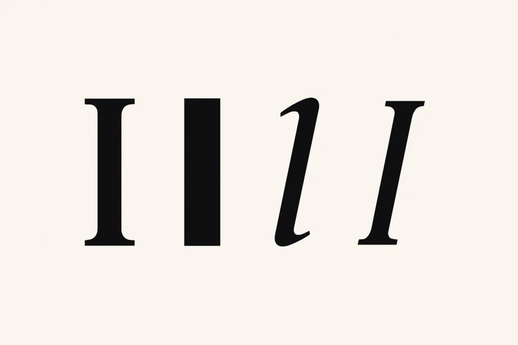
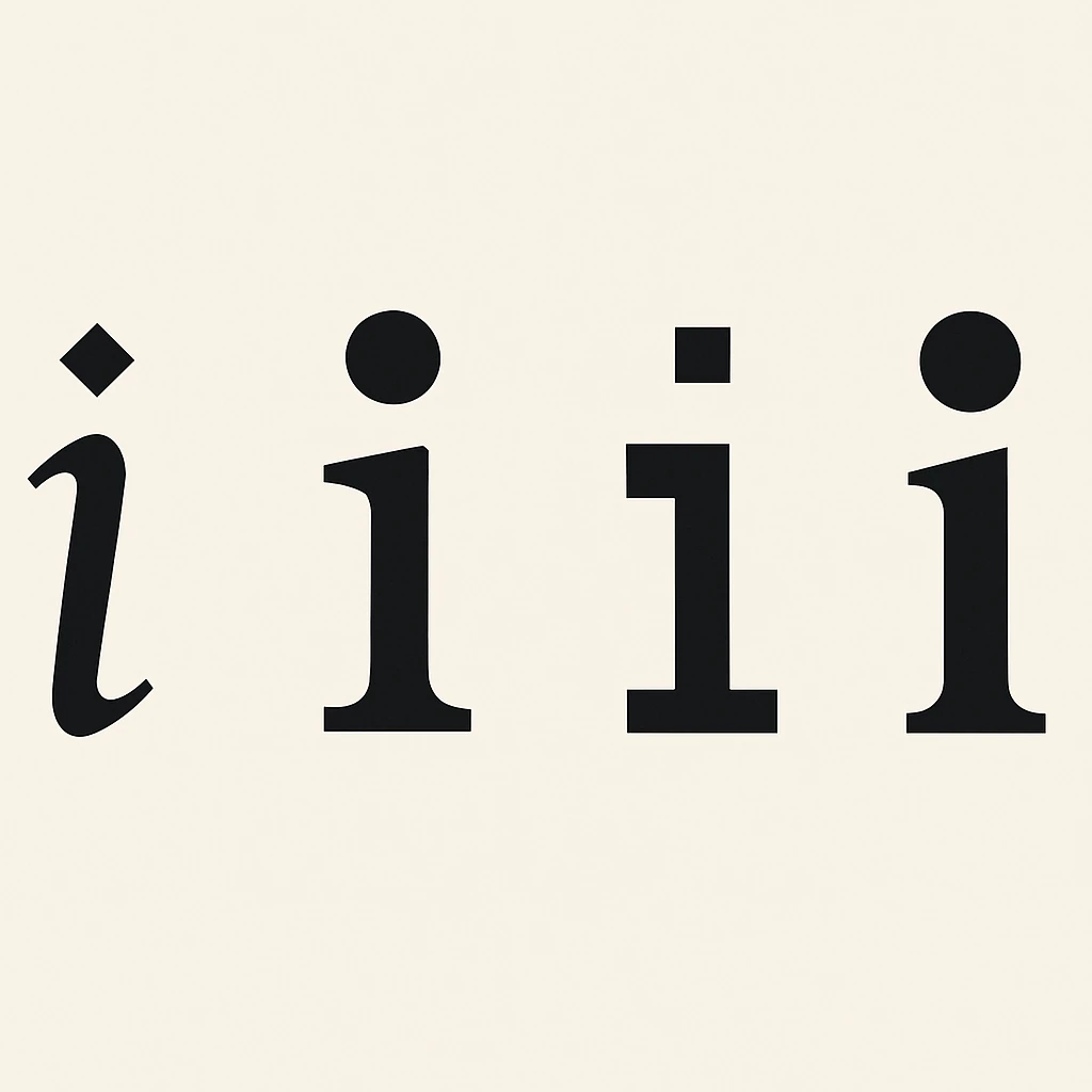
Young writers often confuse lowercase i with lowercase letter l and the number 1. These similar vertical forms create natural mixups that teachers must specifically address.
The personal significance of “I” makes it especially engaging for children developing self-awareness. Kids take particular pride in learning to write the letter that represents themselves.
Fascinating Words That Start with I
The letter I begins a remarkable collection of words that expand our understanding and imagination.
“Illuminate” literally means to bring light, but extends to bringing clarity and understanding, much like the letter I itself brings clarity to writing.
“Infinite” encompasses boundlessness and limitlessness – stretching beyond what we can comprehend, yet captured in a word beginning with a single stroke.
“Intricate” describes complex, detailed patterns – a contrast to the simplicity of I itself, yet begun by this unassuming letter.
“Identity” – perhaps most appropriately – begins with I, encapsulating how we understand ourselves as distinct individuals, just as this letter stands distinct among the alphabet.
The Central Line: I’s Lasting Impact on Language
As we’ve explored, this simple vertical stroke carries remarkable significance across language, psychology, design, and culture.
Letter I represents the most fundamental aspects of human experience – our sense of self, our position in space, and our connection between earth and sky. Its form is perhaps the most elemental symbol humans create.
In English especially, letter I serves as both a humble servant and a powerful presence. It forms essential parts of countless words while also standing alone as the word that represents the self.
As writing and language continue to evolve in the digital age, I maintain their essential identity. Whether typed, swiped, or spoken to voice recognition software, this letter continues its ancient role in human communication.
Perhaps the enduring power of I comes from its perfect balance of simplicity and significance – a reminder that the most fundamental elements often carry the greatest meaning.
Words That Begin With Letter I
letter I stands tall — symbolizing identity, integrity, and innovation. These I-words echo their upright essence:
- Income – The reward of consistent work, especially online and independent. Income ideas
- Influence – The power to shape thoughts, trends, and culture. Social influence
- Intuition – The silent signal that often guides us right. Science of intuition
Continue Your Alphabet Journey
Explore More Letters:
A | B | C | D | E | F | G | H | I | J | K | L | M | N | O | P | Q | R | S | T | U | V | W | X | Y | Z
Share this article:
Did you enjoy learning about the letter H? Share your thoughts in the comments below or spread the knowledge by sharing this article with fellow language enthusiasts!